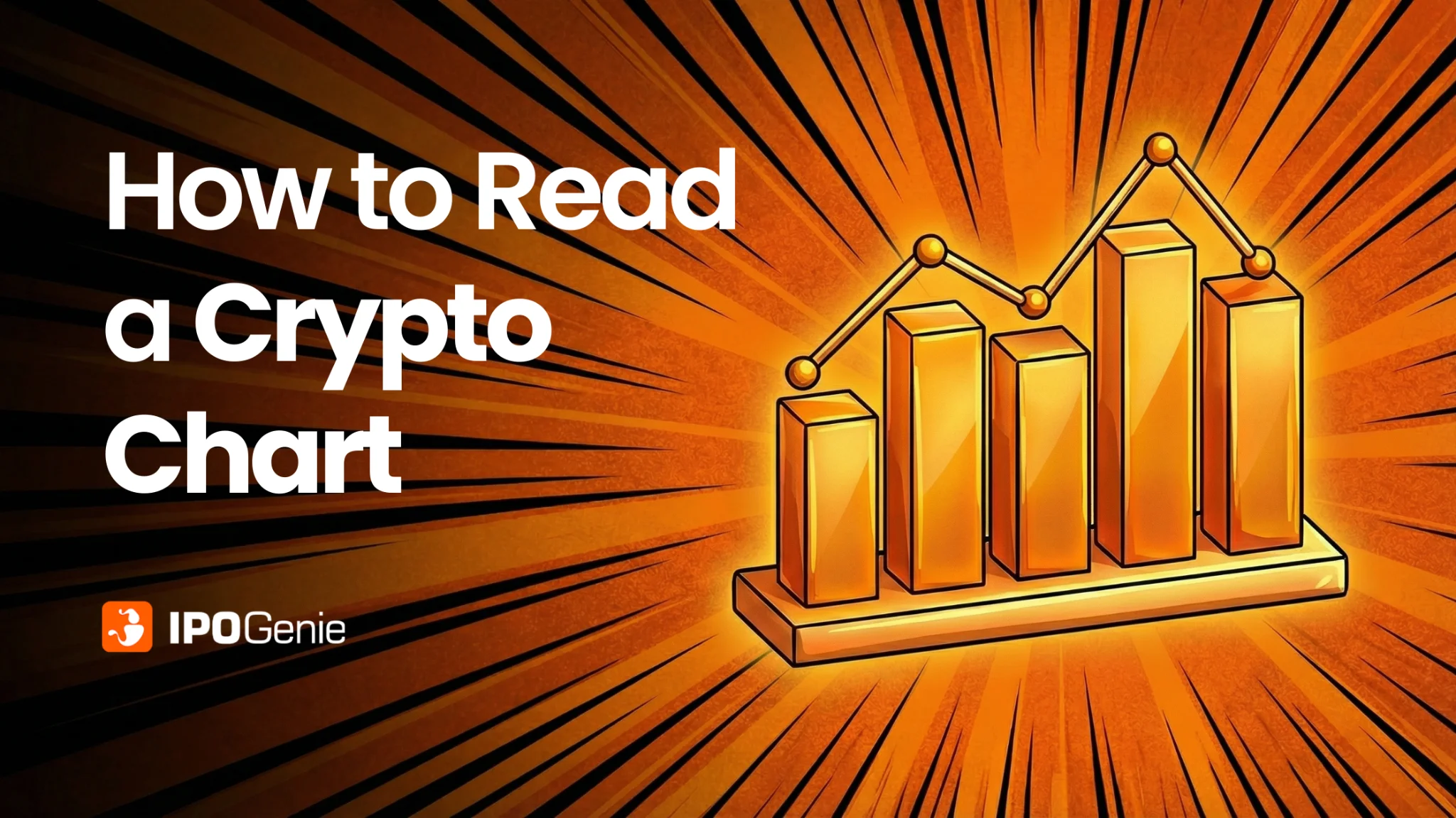
If you are new to cryptocurrency, looking at a crypto chart can feel like reading a foreign language. Candles, lines, colors, and numbers can be overwhelming. But once you understand the key terms and what they mean, reading crypto charts becomes much easier. Think of this as your crypto chart reading guide for beginners. Let us look at some of the charts and understand them.
What Is a Crypto Chart?
A crypto chart is a visual representation of a cryptocurrency's price over time. It shows how a coin's value moves and helps you spot trends, patterns, and potential buying or selling opportunities.
Charts often include market capitalization, volume, and supply data, making them a key tool for understanding how to read a crypto chart and evaluate a project's overall size and growth potential.
Types of Crypto Charts and How to Read Them
While candlestick charts are the most common, beginners should know about the other chart types too. Each chart type has its own purpose and can reveal different insights.
Candlestick Charts: Real Crypto Examples Explained
One of the most commonly used charts in crypto is the candlestick chart. This shows the same price data as bar charts, but more clearly and visually. That is the reason why it is widely used in crypto.
- Green candle: price closed higher than it opened
- Red candle: price closed lower than it opened
- Wicks: price rejection zones where buyers or sellers pushed back
Candlestick charts show who is in control, buyers or sellers, during each time period.
- A series of green candles on Bitcoin's daily chart usually means buyers are confident and pushing the price up.
- A red candle with a long lower wick, like on Ethereum, means sellers tried to push the price down, but buyers stepped in and stopped it, creating support.
- In altcoins like Solana, long upper wicks near resistance can signal that upward moves are slowing down.
Candlestick charts make it easy to see the battle between buyers and sellers and understand market trends at a glance. Best used for patterns, timing, and decision-making.
Bar Charts: See Price Action in Detail
Bar charts show price movement in each time period, similar to candlestick charts, but in a simple bar format. Each bar tells you:
- Opening price - where the price started
- Highest price - the top of the bar
- Lowest price - the bottom of the bar
- Closing price - where the price ended
By looking at the bar, you can quickly see how much the price moved and whether buyers or sellers were in control.
Best for: Understanding market strength and price changes clearly.
Keep in mind: They can be a little harder for beginners to read at a glance compared to candlestick charts.
Bar charts are great when you want a more detailed view of crypto price action and trends.
Line Charts: See the Big Picture Easily
A line chart is the simplest type of crypto chart. It connects the closing prices over time to make a single line. That's it — no highs, no lows, no extra details.
Line charts are great for seeing the overall direction of the market: whether prices are going up, down, or sideways.
Best for: Spotting long-term trends and understanding the bigger picture.
Keep in mind: They don't show short-term price changes or volatility.
Line charts give a clean, easy-to-read view of crypto trends, making them perfect for beginners who want to understand market direction without distractions.
Heikin-Ashi Chart
What it shows: A modified candlestick chart that smooths price fluctuations for a cleaner trend view.
How it helps: It reduces noise from sudden spikes or drops, making it easier to spot long-term trends and plan trades or investments. Beginners often use Heikin-Ashi to confirm trend direction before making decisions.
Timeframes: How Long Each Candle or Bar Represents
The timeframe you pick decides how much price movement each candle or bar shows.
- Short timeframes (like 1–15 minutes): Prices move fast and can jump up or down quickly. This is exciting for active traders but can feel overwhelming for beginners.
- Long timeframes (like daily or weekly): Prices move more smoothly, showing the bigger picture of the trend.
Beginner tip: Start with longer timeframes. They help you see the real story of a crypto's movement without getting distracted by tiny, random price changes.
Price and Volume: The Heartbeat of Crypto Charts
Every crypto chart has two main axes:
- Price (usually on the right): Shows how much the coin costs
- Volume (usually at the bottom): Shows how many coins are being traded
Think of volume as a confirmation tool:
- If the price moves on low volume, the move might be weak and may not last.
- If the price moves on high volume, it shows real interest and strength.
Beginner tip: Always look at price and volume together. They tell the full story of what's happening in the market, not just the price alone.
Indicators and Overlays - Tools to Read Crypto Charts
Crypto charts come with two main types of tools:
- Overlays: These sit right on top of the price chart. Think of them like glasses that make the price easier to see. Example: moving averages (MA).
- Indicators: These usually appear below the chart. They act like vital signs for the market, showing momentum, strength, or hidden trends. Examples: RSI and MACD.
Beginner tip: Start with just one or two tools at a time, and use them on longer timeframes. This keeps things simple and helps you see the real market trend without getting confused by small, quick price changes.
Moving Averages - See Trends Clearly
Moving averages (MA) are lines that smooth out price movements on a crypto chart, helping you see the market trend more easily.
- Short MA: Reacts quickly to price changes. Good for spotting short-term moves.
- Long MA: Moves slowly. Shows the overall trend and reduces noise.
- Crossovers: When the short MA crosses above or below the long MA, it can signal a possible trend change.
Beginner tip: Use moving averages on longer timeframes. This makes trends clearer and helps you see the real market direction without being distracted by small price swings.
Bollinger Bands - See When Prices Stretch or Squeeze
Bollinger Bands are lines on a crypto chart that show how much the price is moving or how "stretched" it is. They help you see if a crypto might be too high, too low, or ready to return to the trend.
- Upper band: Price is stretched high, could be temporarily expensive
- Lower band: Price is compressed low, could be temporarily cheap
- Middle band: Acts like a magnet, prices often move back toward it
Beginner tip: Use Bollinger Bands on longer timeframes. This makes it easier to see real trends and volatility without being distracted by short-term price jumps.
Fibonacci Retracement - Spot Likely Pullback Levels
Fibonacci retracement is a tool that helps you see where a crypto price might pause or bounce after a big move. Traders watch key levels — 38%, 50%, and 61% — because prices often react near them.
If the price pulls back to one of these levels, it could act as support or resistance before the trend continues.
Beginner tip: Use Fibonacci retracement on longer timeframes. This makes the levels more reliable and helps you see real trend pullbacks without getting distracted by short-term swings.
RSI: See Market Momentum
The Relative Strength Index, or RSI, is a popular tool that shows whether buyers or sellers are in control.
- Above 70: The crypto may be overbought, which means the price rose too fast and could pull back.
- Below 30: The crypto may be oversold, which means selling pressure may be ending and a bounce could happen.
Beginner tip: Use RSI on longer timeframes. This makes the signals more reliable and helps you see real momentum trends without reacting to every small price change.
MACD: Spot Trend Momentum
The MACD, or Moving Average Convergence Divergence, is a tool that compares two moving averages to show trend strength and momentum.
- When the MACD crosses above the signal line, it shows bullish pressure and that buyers are gaining control.
- When the MACD crosses below the signal line, it shows bearish pressure and that sellers are gaining control.
Beginner tip: Use MACD on longer timeframes. This makes the signals more reliable and helps you see real trend changes without being misled by short-term price swings.
Stochastic Oscillator: Spot Overbought and Oversold Levels
The stochastic oscillator compares the current price to its recent trading range to show market momentum.
- Above 80: The crypto may be overheated. Buyers have pushed the price up quickly and a pullback could happen.
- Below 20: The crypto may be exhausted. Selling pressure may be ending and a bounce could occur.
Beginner tip: Use the stochastic oscillator on longer timeframes. This makes the signals more reliable and helps you see real market extremes without overreacting to short-term price changes.
Chart Patterns and Crowd Psychology
Chart patterns happen because people tend to behave in similar ways. Fear and greed often drive the market.
One common pattern is the Head-and-Shoulders pattern. It usually appears after an uptrend and shows that buyers are losing control while sellers may start pushing the price down.
By learning to recognize patterns, traders can anticipate possible market moves instead of just guessing.
Beginner tip: Look at patterns on longer timeframes. They are more reliable and less affected by short-term price changes.
Double Tops and Bottoms: Spot Market Turning Points
Double tops and bottoms are classic patterns that show how crowds behave in the market.
- Double Top: Buyers try twice to push the price higher but fail at the same level. This shows that sellers may take control and the price could fall.
- Double Bottom: Sellers try twice to push the price down but fail at the same level. This shows that buyers are gaining control and the price could rise.
Beginner tip: Look at these patterns on longer timeframes. They are clearer and more reliable, helping you anticipate trend reversals without reacting to small, short-term price swings.
Triangle Patterns
- Symmetrical triangle: indecision before expansion
- Ascending triangle: buyers pushing higher
- Descending triangle: sellers pressing lower
Key Terms in Crypto Charts Explained
Here are some important terms you will see on almost every crypto chart:
- Volume: The number of coins/tokens traded during a time period. It helps confirm price moves.
- Support and Resistance: Price levels where buying or selling often appears.
- Trend Lines: Lines connecting highs or lows to show the market direction.
- Moving Averages: Lines that smooth price data to show the overall trend. They can also hint at buy or sell signals.
- Market Cap Overlay: Shows the total value of all coins in circulation, which ties directly into a project's tokenomics structure.
Learning these terms is an important part of your crypto chart reading guide and helps you read crypto price charts effectively.
Tips for Beginners
If you are just starting, it is best to focus on one coin at a time, like Bitcoin or IPO Genie ($IPO). Start simple and gradually build your understanding of crypto charts and market trends.
- Use line or area charts first to see overall trends.
- Move to candlestick or Heikin-Ashi charts for more detailed analysis.
- Combine chart reading with circulating supply and fully diluted market cap analysis to understand the project's size and dilution risk.
- Keep a crypto chart reading guide handy for reference.
These tips help beginners learn crypto chart reading step by step without getting overwhelmed by too much information at once.
Why Chart Reading Matters
Learning to read crypto charts is essential for understanding market cap in crypto investing. Charts show more than price; they show trends, investor sentiment, and potential opportunities. Long-term price sustainability often depends on real token utility and network usage. Even beginners can gain confidence by mastering key terms and patterns.
This is especially important when evaluating crypto presales and early-stage token launches, where volatility and low liquidity are common.
In summary: Reading crypto charts doesn't have to be complicated. By learning candlestick charts, understanding key terms, and practicing reading crypto price chart techniques, you'll develop a clear picture of market trends. Combine this with market cap analysis, and you'll have a strong foundation for smarter crypto decisions.
How Traders Use Charts and Indicators to Make Decisions
Putting It All Together
Reading crypto charts helps you understand price, trends, and market strength. Charts like line, candlestick, Heikin-Ashi, and bar charts show different details. Volume, support and resistance, trend lines, and market cap give clues about buyer and seller activity. Indicators like moving averages, MACD, RSI, Bollinger Bands, and Fibonacci retracements help spot momentum, overbought or oversold conditions, and possible trend changes.
Even as a beginner, you can start with one coin at a time, focus on longer timeframes, and use only a few tools at once. Practicing this way helps you see trends clearly, make smarter decisions, and understand the market without guessing.
Join the IPO Genie presale now

Disclaimer: This article is for informational and educational purposes only. It is not financial, investment, or legal advice. Cryptocurrencies are highly volatile and involve risk. Always do your own research and consult a qualified professional before making any investment decisions.
Frequently Asked Questions
Q: What is the best chart type for crypto beginners?
Line charts are the simplest starting point because they show overall price trends without extra detail. Once comfortable, move to candlestick charts for more insight into buyer and seller activity.
Q: What timeframe should I use when reading crypto charts?
Start with daily or weekly timeframes. They show clearer trends and filter out the noise of short-term price swings that can be misleading for beginners.
Q: What does high volume mean on a crypto chart?
High volume means many coins are being traded during that period. When price moves happen on high volume, the move is generally considered stronger and more reliable than one on low volume.
Q: Do I need to learn all indicators at once?
No. Start with one or two tools like moving averages or RSI. Adding too many indicators at once can create confusion. Build your understanding gradually.