A stock jumps 20% on its first day of trading. Everyone calls it luck. It isn't. That first-day move is the visible output of weeks of private negotiation between underwriters and institutional investors, and once you know what to look for, you can read it like a signal instead of a surprise.
This reference breaks down how IPO prices actually get set, why many IPOs leave money on the table, and what that gap tells you about the deal itself. Every claim here traces back to a primary source: Jay Ritter's IPO database at the University of Florida, SEC EDGAR filings, peer-reviewed finance journals, and exchange trading data.
Note: Where a number couldn't be verified, it's flagged, not guessed at.
The First-Day Pop, By the Numbers
Since 1980, US IPOs have delivered an average first-day return of 19.0% (the percentage gain from offer price to first closing price), according to Ritter's dataset. That average moves around a lot year to year. In 2024 it sat at 15.3%. In 2025 it jumped to 29.3%, with companies leaving a combined $13.1 billion on the table.
Two formulas do most of the heavy lifting in this kind of analysis:

|
The first tells you the percentage move. The second tells you the actual dollar cost to the company of pricing below what the market was willing to pay. A 20% first-day pop on a small deal might mean a few million dollars left behind. The same percentage on a multi-billion dollar offering means hundreds of millions handed to day-one buyers instead of the company's own balance sheet.
That relationship is known as partial price adjustment. What matters here is the takeaway: the size of the pop is a demand signal set weeks before the stock ever trades, not a random market mood.
The Three Mechanics That Actually Control an IPO
Before you can read the data, you need the plumbing. Three mechanisms shape almost everything that happens to an IPO's price in its first six months.
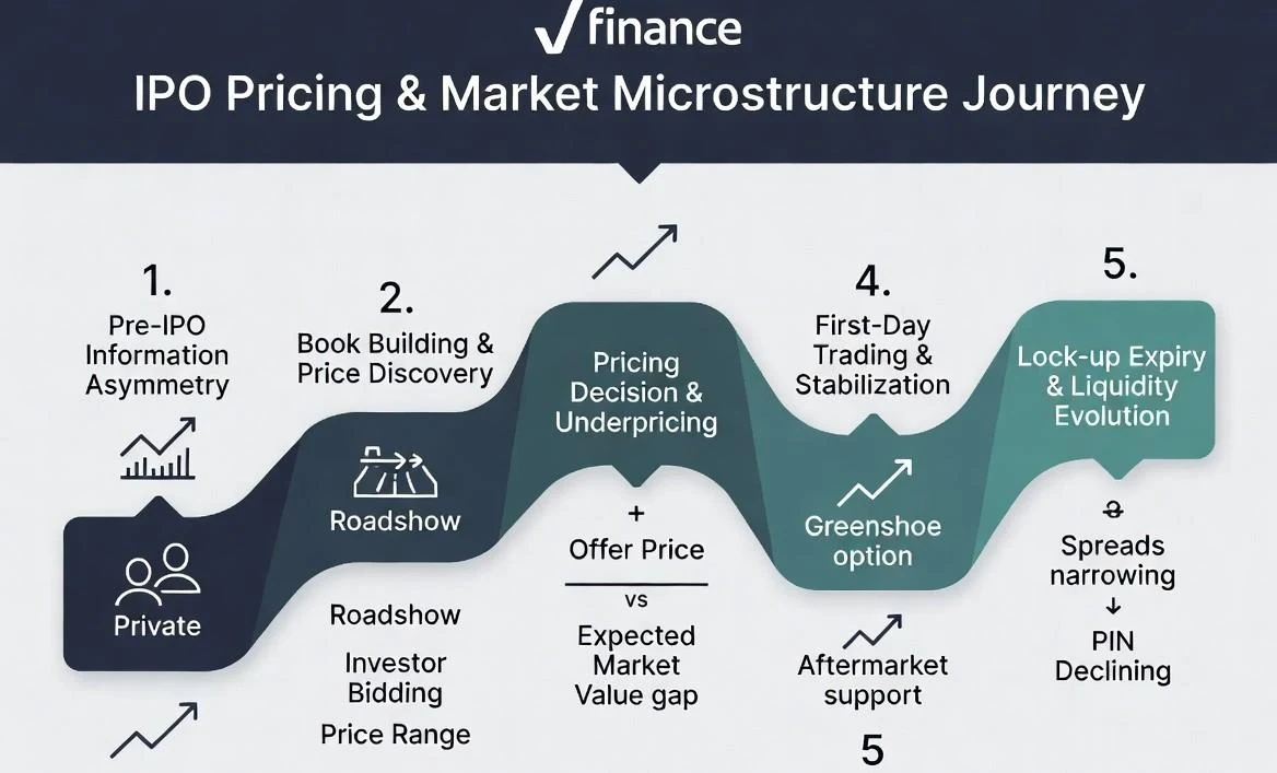
Book-building is how underwriters (the investment banks managing the offering) figure out what price the market will actually bear. They go to large institutional investors and ask two questions: how many shares, and at what price. That feedback, gathered over one to two weeks during a roadshow, becomes the basis for the final offer price.
The greenshoe option (formally an overallotment option) lets underwriters sell up to 15% more shares than originally planned if demand is strong. It's the main tool used to stabilize the stock if the price drops right after listing.
The lockup period stops company insiders, employees, and early investors from selling their shares for a set window, typically 180 calendar days. The purpose is simple: prevent a flood of new supply before the market has had time to absorb basic information about the company as a public business.
The Fourth Mechanic People Forget: The Underwriting Fee
Book-building, the greenshoe, and the lockup get most of the attention, but none of them explain what the deal actually costs the company. That's the gross spread (the underwriting fee, taken as a cut of total proceeds).
According to Ritter's own data tables, gross spreads have remained close to 7% on moderate-size deals from 2001 through 2025, a figure that's stayed remarkably sticky for over two decades despite huge shifts in deal size and market conditions. That consistency matters for anyone modeling net proceeds, since a flat 7% assumption holds up reasonably well for a typical deal, but breaks down fast for the largest offerings, where competition among banks compresses the percentage even as the total dollar fee grows. Ref: Underwriter Syndicate Economics
Why Underpricing Exists At All
If a company could raise more money by pricing its IPO higher, why leave money on the table on purpose? Three overlapping explanations answer this, and none of them require assuming the market is irrational.
- The winner's curse. Economist Kevin Rock's 1986 model, published in the Journal of Financial Economics, splits IPO buyers into two groups: informed investors who can spot a good deal, and uninformed investors who can't. In a genuinely strong IPO, informed investors pile in, and everyone gets a small allocation. In a weak one, informed investors stay away entirely, leaving uninformed investors stuck with a bigger share of exactly the deal they should have skipped.
If this kept happening, uninformed investors would eventually stop showing up to IPOs altogether. So companies underprice deliberately, as a kind of insurance that keeps everyday investors willing to participate.
- Liquidity risk. Ellul and Pagano's 2006 study in the Review of Financial Studies, based on 337 IPOs on the London Stock Exchange between 1998 and 2000, found a positive relationship between expected aftermarket illiquidity (how hard a stock is to trade once it lists) and the size of the discount investors demand upfront. In plain terms, the harder a stock is expected to trade after listing, the more it gets discounted before listing, because investors want compensation for that risk.
The precise magnitude sometimes cited for this relationship could not be independently confirmed in this research pass and is not included here until sourced.
- Investor behaviour and flipping. Houge, Loughran, Suchanek, and Yan's 2001 study on IPOs from the early to mid 1990s looked at flipping (investors buying IPO shares only to resell them almost immediately). Heavy flipping in the days right after listing tends to signal weaker long-term performance. The precise magnitude sometimes cited for this relationship could not be independently confirmed here and should be treated as unverified until sourced directly from the paper.
These three explanations aren't competing theories. They're different angles on the same underlying problem: at the moment of the IPO, the company and its underwriters know more about the business than the public buyers do.
Reading an Actual S-1 & What the Filing Says
Every IPO files a Form S-1 (a registration statement filed with the SEC before a company can sell shares to the public) before it can price. Reading one shows these mechanics in plain legal language, not theory.
Take Reddit's original 2024 S-1 filing. The initial filing left the price blank: "We anticipate that the initial public offering price per share... will be between $ and $." That's completely normal. The blank gets filled in only after book-building wraps up. In Reddit's case, a later amendment to that same filing set the range at $31.00 to $34.00, and the company ultimately priced at the top of that range.
The same filing shows the greenshoe option in real legal wording: the company granted underwriters the right to purchase additional shares "to cover over-allotments." That's the exact mechanism described above, written the way it actually appears in a live document.
Three Real IPOs, Same Mechanics, Different Outcomes
Snowflake priced its September 2020 IPO at $120 per share, well above its revised $100 to $110 range, and opened at $245, a 104% jump. It closed its first day up nearly 112%, making it the largest software IPO on record at the time. Airbnb priced the same year at $68 and opened around $146, a similarly outsized pop. Both used traditional IPO book-building, but the demand signals and market context were different.
Robinhood priced its July 2021 IPO at $38, the bottom of its range. The stock had been guided at $38 to $42. Shares opened at $38 and fell fast. The stock closed its first day 8.4% below the offer price, as CNBC reported. This shows underpricing doesn't guarantee a pop. Weak demand can still lead to a discount. That discount can still fail to hold.
The gap between them wasn't the process. It was the demand signal collected during the roadshow, which is exactly the kind of information this reference is built to help you read.
Aftermarket Dynamics: What Happens After the Bell Rings
Once trading starts, the underwriter's job shifts from price discovery to active support. If the stock starts sliding, they can step in using the overallotment shares from the greenshoe to slow the fall.
In the same Ellul and Pagano UK dataset referenced above, average underpricing narrowed noticeably over the first month of trading as bid-ask spreads (the gap between buying and selling price, a proxy for how easily a stock trades) tightened and the stock became easier to trade.
The researchers also tracked the Probability of Informed Trading (PIN), a measure of how much of the trading activity reflects investors acting on private information. PIN values were highest immediately after listing and declined over subsequent weeks, consistent with information asymmetry resolving itself as more public detail about the company became available.
None of this is random. It's the visible process of a market catching up on information it didn't have during book-building.
How Analysts Actually Use Exchange Trading Data
The Ritter database and tell you what price got set and when. They don't tell you how a stock actually traded once it hit the market. For that, institutional analysts turn to TAQ (Trade and Quote data, a database that records every trade and every bid and ask quote on US exchanges).
TAQ data is what lets researchers calculate the bid-ask spread minute by minute instead of relying on a single end-of-day number. It's also how studies like Ellul and Pagano's actually measured the narrowing spreads discussed above. Beyond spreads, TAQ captures quote depth (how many shares are available at the best bid and ask price) and the exact timing of the first trade after an IPO opens, which matters because a delayed opening cross often signals the exchange is struggling to match a large imbalance of buy and sell orders.
For a practical example, if you're trying to estimate how much it would actually cost to build or exit a position in a newly listed stock on day one, TAQ-level bid-ask spread data gives you a far more realistic number than the headline first-day return. A stock can post a strong first-day return and still have a wide, choppy spread that makes it expensive to trade in size. The two numbers answer different questions, and conflating them is a common mistake even among experienced investors.
What the Long-Run Ritter Data Shows Beyond Day One
Most IPO discussion stops at the first-day pop, but Ritter's longer-run tables show two slower-moving trends worth knowing if you're evaluating deal quality over time.
Valuation multiples have crept up steadily. The median price-to-sales ratio for tech IPOs was roughly $9 to $11 in 2024, compared to about $3 to $4 back in 1980. During the dot-com bubble, that multiple briefly spiked to $49.5, a level that took over two decades to even begin approaching again. Reading a single year's IPO multiple in isolation without this longer baseline can make an ordinary valuation look either alarmingly high or artificially cheap.
Companies are waiting longer to go public. The average age of a company at IPO climbed from 8 years in 2022, to 10 years in 2023, to 14 years in 2024. That shift matters at the microstructure level because an older, more mature private company typically arrives with more historical financial data on file, which can reduce the information asymmetry problem discussed earlier in this reference and, in theory, reduce the underpricing needed to compensate uninformed investors.
How the Market Changed After 2021
This underpricing pattern held fairly steadily for decades, but the IPO market itself hasn't. Renaissance Capital's data shows 2021 was the biggest year for IPO proceeds ever recorded, with 397 companies raising $142.4 billion. Then interest rates rose sharply, valuations corrected hard, and 2022 proceeds collapsed to just $7.7 billion across only 71 deals, the slowest year by proceeds in the firm's history at the time.
By 2025, the market had partially recovered but stayed selective, with 71 IPOs raising $100 million or more and averaging an 18% return from the offer price. Then 2026 delivered a genuine outlier. Renaissance Capital's second-quarter 2026 review shows 48 IPOs raised a record $104.8 billion in that quarter alone, driven almost entirely by a single deal that raised $75 billion and rose 19% on its first day, commanding a $1.7 trillion market cap at listing, making the 2026 cohort's second quarter unlike anything in the data before it.
The underlying mechanics- book-building, underpricing, greenshoe stabilization- haven't changed. What's changed is the size and concentration of the deals moving through that same pipeline.
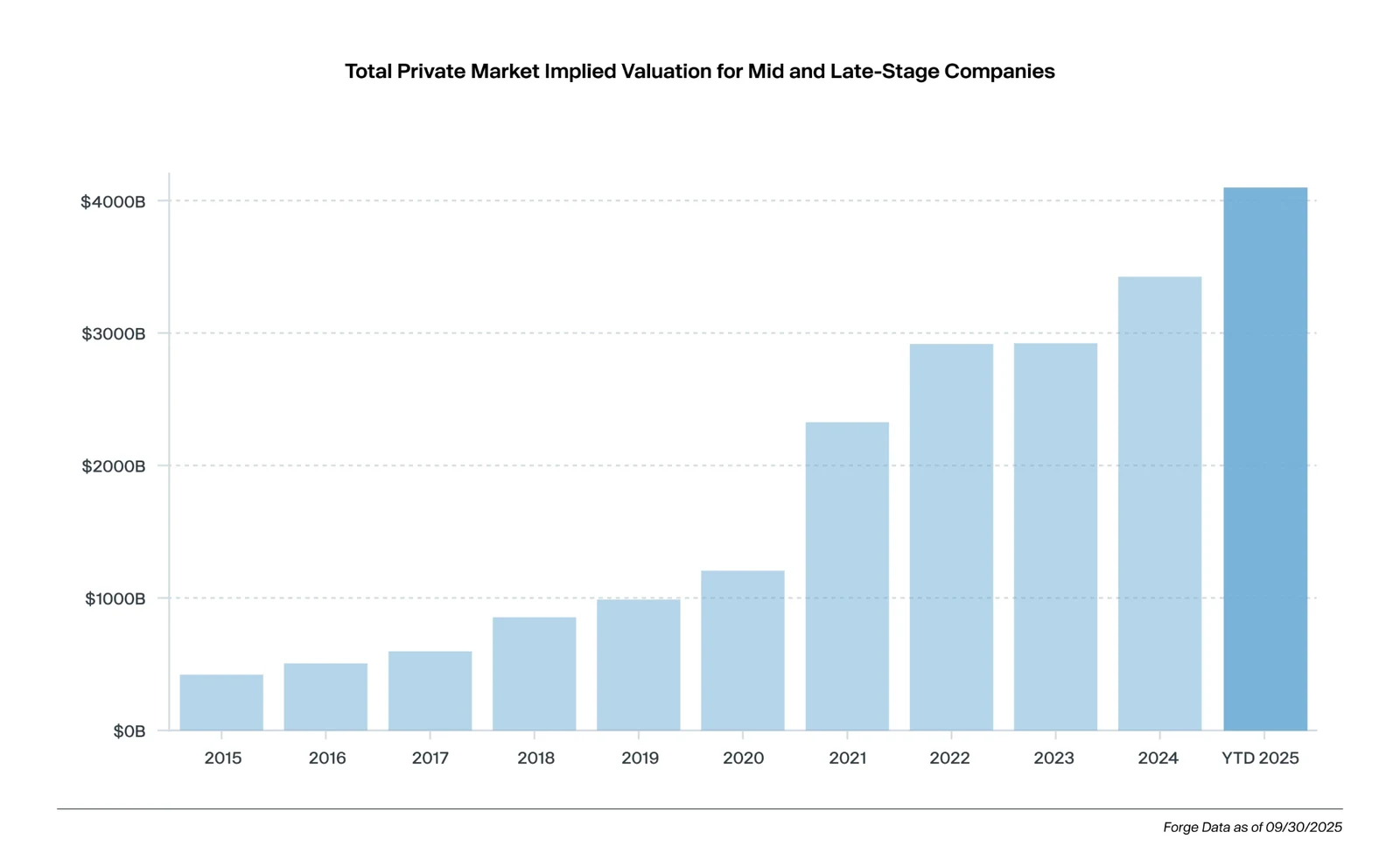
Private companies now stay private much longer. This has fueled growth in secondary markets. Forge Global data shows the private market grew from $421 billion in 2015 to $4.1 trillion by Q3 2025, Forge reported. AI companies are also reshaping IPO demand patterns. Mega private funding rounds from OpenAI and Anthropic pushed 2026 capital formation to a new high, Forge noted. This demand is a new variable underwriters must price for. It didn't exist at this scale before 2023
What Investors Can Learn From IPO Microstructure
A big first-day pop doesn't mean strong fundamentals. It often just means the price was set low. Allocation matters more than most retail investors realize. Getting shares at the offer price is the real advantage. Information asymmetry favors institutional buyers over everyday investors. That gap explains most of the underpricing pattern. Range revisions are a useful signal worth watching. A range raised before pricing often points to real demand.
Implications for RWA and Tokenized Assets
For teams working on real-world asset (RWA) tokenization, these dynamics offer a useful parallel, though it's worth being clear about what kind of claim this is. This is an informed comparison, not a finding from the cited research. None of the studies above tested tokenized or on-chain assets directly. But the same underlying mechanics- price discovery under uncertainty, liquidity formation, and information asymmetry between issuer and buyer- aren't unique to traditional equities.
Tokenized assets aiming for secondary market trading will likely face comparable early-stage challenges: high initial volatility, liquidity discounts, and a gap between what an issuer knows and what a buyer can verify.
How to Check Any of This Yourself
None of the sources used in this reference require a paid terminal or an institutional login.
Jay Ritter's IPO data page publishes his full tables for free, including first-day returns by year, gross spreads, and long-run performance. SEC EDGAR lets you pull any company's S-1 and every amendment filed after it, so you can watch a price range move in real time the same way underwriters do internally. Comparing the earliest S-1 filing against the final S-1/A right before pricing shows you exactly how much the range moved and in which direction, which is the same signal discussed earlier in this reference.
TAQ-level data is less accessible for free, but NYSE and Nasdaq both publish some aggregate trading statistics, and most brokerage platforms show real-time bid-ask spreads that give a rough proxy even without full TAQ access. For quarterly and annual market-level context, Renaissance Capital's public reviews, linked throughout this piece, are free and updated regularly.
Key Takeaways
- IPO pricing looks chaotic from the outside but follows a consistent, well-documented pattern rooted in information asymmetry between issuers and buyers
- Underpricing compensates uninformed investors for the risk of ending up allocated into a weak deal (the winner's curse)
- Book-building is the mechanism underwriters use to extract real demand signals before the stock ever trades
- Gross spreads have held near 7% for moderate-size deals for over two decades, even as mega-deals compress that percentage
- Aftermarket stabilization, narrowing spreads, and declining PIN scores all show the market catching up on information in the weeks after listing
- Valuation multiples and time-to-IPO have both trended upward over the past decade, changing what a "normal" deal looks like
- The core mechanics have stayed consistent for decades even as deal size and market conditions have shifted dramatically since 2021
Frequently Asked Questions
Does the first-day return formula ever get calculated differently across studies?
Mostly no, the offer-price-to-close formula is standard. Where studies differ is in what they exclude from the sample. Ritter's dataset, for example, excludes SPACs, unit offers, ADRs, and IPOs priced under $5 per share, which is why headline "average IPO return" figures can vary between sources even when they're pulling from overlapping time periods.
If two IPOs post the same underpricing percentage, does that mean they carry the same risk?
Not necessarily. A 20% pop driven by a price range that was raised sharply during book-building reflects genuine, verified demand. A 20% pop on a deal priced at the bottom of its range, or with thin institutional participation, can reflect the opposite: a deal that struggled to find buyers even at a discount. The percentage alone doesn't tell you which situation you're looking at.
Does heavy oversubscription during book-building predict strong long-term performance?
Not reliably. Oversubscription measures day-one demand, not long-run fundamentals. Research on long-run IPO performance, including Ritter's own long-horizon data, has repeatedly found that IPOs with the biggest first-day pops often underperform over the following one to three years compared to more modestly priced deals.
Where can I find historical gross spread data broken down by deal size?
Ritter's public data tables track mean and median gross spreads by year going back to 1980, alongside the number of managing underwriters per deal. It's one of the few places this data is aggregated and published for free rather than sitting behind a paid research terminal.
What's the practical difference between checking TAQ data and just watching a real-time stock quote?
A live quote shows you the current bid and asks at that instant. TAQ data lets you reconstruct the entire trading history of a stock, minute by minute, including every quote change and trade, which is what makes it possible to measure how a spread behaved over an entire day or week rather than at one moment in time.
Is there a way to check book-building demand for a specific upcoming IPO before it prices?
Yes, indirectly. Watch for amendments to the S-1 filing on SEC EDGAR. A price range that gets revised upward between filings is a public, verifiable signal that institutional demand during the roadshow came in stronger than the company's original estimate, the same signal underwriters themselves are pricing off of.